

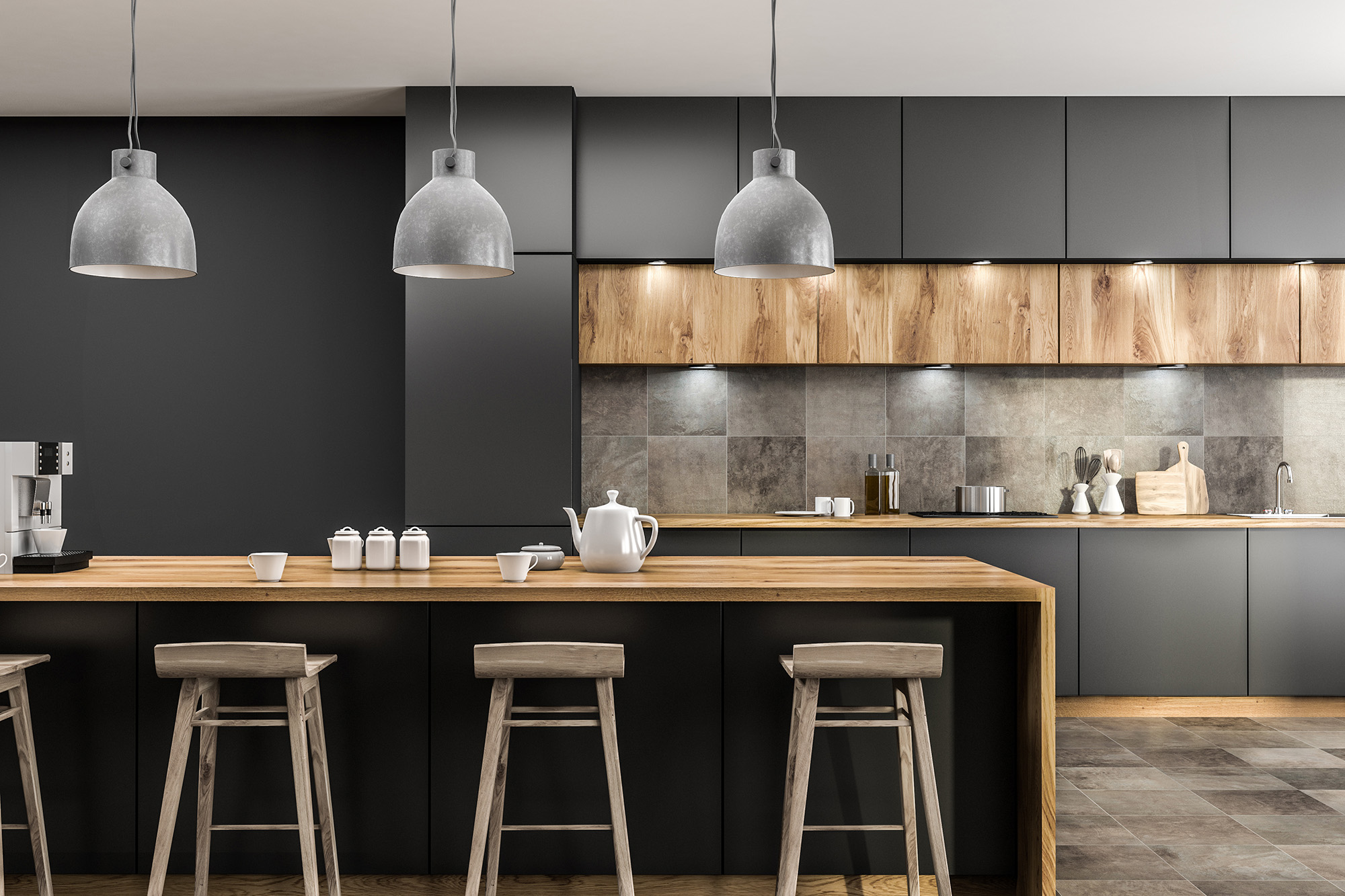
Black fixtures, warm wood, and cream walls have become a popular combination because they feel warm, clean, and current without being too cold or too plain. You see this palette in kitchens, mudrooms, powder rooms, laundry rooms, fireplace surrounds, entryways, and feature walls. It works because the black adds definition, the wood adds warmth, and the cream keeps the space softer than bright white.
The challenge is that tile can either pull this whole look together or make it feel slightly wrong. A tile that is too cool can make warm wood look orange. A tile that is too yellow can make cream walls look dated. A tile that is too glossy can make black fixtures feel harsh. At CarpetWorks, the best tile choice starts with undertones, finish, scale, and where the tile will actually be used.
Start with the undertones already in the home
Before choosing tile, look at the fixed finishes that are already in the space. Warm wood can lean honey, oak, walnut, red-brown, or golden. Cream walls can lean ivory, beige, greige, or warm white. Black fixtures may be matte black, satin black, oil-rubbed bronze, or a softer dark metal. These differences may sound small, but they change how tile reads in real light.
A cool gray tile beside warm oak can make the wood look more orange than it is. A yellow-beige tile beside cream walls can make the whole space feel older than intended. A tile with the right undertone should bridge the materials rather than repeat them exactly. Soft greige, warm white, taupe, clay, limestone-look, travertine-look, and muted stone tones often work better than sharp white or icy gray.
Use black as a detail, not the entire design
Black fixtures are strong even when they are simple. Cabinet hardware, faucets, lighting, shower frames, door handles, stair rail details, or fireplace accents can quickly become the visual outline of a room. If the tile also has heavy black veining, dark grout, bold borders, and high contrast, the space can start to look busy.
A more balanced approach is to let black act as the anchor. Tile can pick up softer charcoal, warm gray, taupe movement, or subtle dark mineral veining without turning the whole room graphic. This works especially well for kitchen backsplashes, fireplace surrounds, entry tile, and powder room walls where you want the space to feel designed, not overly themed.
Choose the tile finish based on the room’s function
Finish matters as much as color. A glossy tile can brighten a backsplash or small wall area, but it can also reflect every light source, water mark, and surface unevenness. In rooms with black fixtures, high shine can make the contrast feel sharper. That may work in a crisp modern kitchen, but it can feel too hard in an entryway, laundry room, or family space.
Matte, satin, honed, and low-sheen tile finishes usually create a softer transition between black, wood, and cream. They are especially useful when the goal is a warm, layered interior rather than a showroom-bright look. For floors, texture and slip resistance should also be considered. A tile that works beautifully on a backsplash may not be practical for an entryway that sees wet shoes, pets, and winter grit.
Be careful with white and cream tile
White tile sounds safe, but it can be surprisingly difficult in a warm neutral home. A crisp white tile can make cream walls look dingy. A creamy tile can look yellow beside a cleaner white countertop, sink, or appliance. A gray-white tile can make warm wood feel disconnected. This is why samples matter.
If you want a light tile, compare it against the actual wall color, wood finish, countertop, fixture finish, and nearby flooring. Warm white, ivory, pale greige, soft taupe, or stone-look tile can feel more natural than a flat white. The right light tile should brighten the room without making the other finishes look accidental.
Match tile scale to the surface
A tile that works on a kitchen backsplash may not work on an entry floor. A tile that looks beautiful around a fireplace may feel too busy across a laundry room floor. Scale changes everything. Small tiles create more grout lines and more pattern. Large-format tiles feel calmer but need enough space to avoid awkward cuts.
For backsplashes, smaller formats, handmade-look tile, subway variations, zellige-style surfaces, and soft rectangular shapes can add texture without overwhelming the palette. For floors, porcelain tile, stone-look tile, and larger formats can create durability and easier maintenance. For accent walls or fireplaces, subtle movement can add depth, but the pattern should not fight with wood grain or black metal details.
Think about grout as part of the palette
Grout is not just a technical detail. It changes the entire look of the tile. Dark grout can create strong lines, which may look intentional in some kitchens but too busy in a small entryway or laundry room. Very light grout can soften the tile, but it may show wear faster in high-use areas.
A warm mid-tone grout is often the easiest bridge between cream walls, warm wood, and black fixtures. It defines the tile without shouting. It can also be more forgiving in practical spaces such as mudrooms, kitchens, and laundry rooms. The goal is to make the tile look finished and easy to live with, not overly delicate.
Choose tile by room, not just by trend
This palette can work across the home, but each room needs its own level of durability. A kitchen backsplash can handle more gloss and texture because it is vertical and easier to wipe. An entryway floor needs grip, strength, and a finish that will not show every footprint. A laundry room needs tile that can handle moisture, detergent spills, and daily traffic.
Powder rooms and fireplaces can take more design risk because they are smaller, more contained surfaces. Mudrooms and kitchens need more restraint because they work harder. A good tile choice should respect both the style of the home and the job the surface has to do.
When black fixtures, warm wood, and cream walls are combined well, the result feels warm, current, and easy to live with. The right tile brings those elements together through undertone, finish, grout, scale, and practical room-by-room performance.
Visit East Hartford, CT to compare tile samples with CarpetWorks and get practical guidance for kitchen backsplashes, entryway floors, laundry rooms, powder rooms, fireplace surrounds, tiled walls, and more. We proudly serve New Haven, Waterbury, Hartford, East Hartford, West Hartford, Middletown, and Manchester, CT and can help you choose tile that works with your home’s real lighting, finishes, and daily use. For product help, showroom guidance, or a project estimate, contact us today.


