

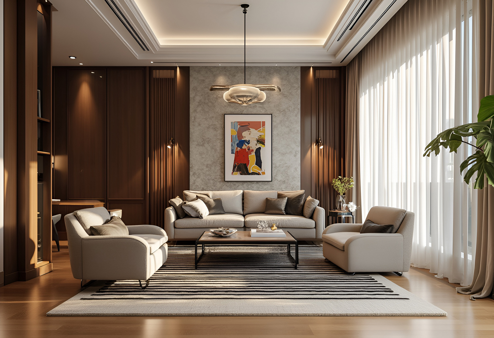
A lot of homeowners ask the same question when finishing a room: should the rug match the curtains. The most accurate answer is no, not exactly. In most spaces, strict matching makes the room look overly coordinated, flat, or dated. What works better is controlled coordination.
At CarpetWorks, we help homeowners build rooms that feel connected without looking staged. The key is understanding how rugs and curtains interact through color temperature, texture, scale, and light. When those elements are aligned properly, a room feels polished and intentional even when nothing is an exact match.
Matching is different from coordinating
Matching means using nearly the same color, pattern, or fabric effect in both the rug and the drapery. Coordinating means those elements relate to each other without duplicating each other.
For example, a cream textured rug and ivory linen curtains may coordinate well because they share a soft, warm tonal family. A bold navy patterned rug and flat navy curtains may technically match, but they can make the room feel heavy unless other materials create separation.
Rooms usually look stronger when the rug and curtains do one of these things:
Share undertones but differ in value or saturation
Repeat one accent color without repeating the full pattern
Contrast in texture while staying within the same design mood
Balance each other so one is visually quieter than the other
Coordinate color by temperature and depth
Color coordination starts with undertone and value. If your curtains are warm white or oatmeal, a cool gray rug may feel disconnected even if both are neutrals. If your rug has strong charcoal or blue-gray content, soft yellow-beige curtains can make the palette feel inconsistent.
A technical way to approach textile color is to think in three levels:
Base tone such as warm neutral, cool neutral, earthy, muted, or saturated
Value such as light, medium, or dark
Intensity such as soft and washed or crisp and high contrast
A room works best when the rug and curtains have some overlap in at least one of those categories. They do not need all three.
For instance, light warm curtains can work with a medium warm rug. Soft cool drapery can work with a darker cool rug. The point is relationship, not replication.
Watch pattern competition carefully
Pattern layering is where many rooms go wrong. If both the rug and curtains have busy, high-contrast motifs, the eye does not know where to settle. That makes the room feel restless.
A practical guideline is to vary both scale and intensity.
If the rug has a large pattern, keep the curtains more subtle
If the curtains have a visible print, the rug should usually have lower contrast
If both have pattern, one should read as texture from a distance rather than obvious motif
Solids are not always plain if the weave, pile, or pleating adds dimension
This is especially important in living rooms and bedrooms, where both surfaces occupy a lot of visual area.
Texture is what makes coordination feel expensive
In better-designed rooms, texture does a lot of the work. A wool rug, woven shade, linen drapery, and upholstered seating can all coordinate even without matching because the room has tactile range.
Texture affects how light is absorbed and reflected. Matte textiles soften a room. Sheen adds brightness and formality. Too much sheen across multiple surfaces can make the space feel synthetic or overly styled.
Examples of smart textile contrast include:
Flat woven curtains with a plush wool rug
Textured boucle or wool rug with smooth drapery panels
Natural fiber rug with soft cotton or linen window treatments
Tonal performance rug with lined curtains that control glare and privacy
The most successful rooms typically mix at least two tactile qualities rather than repeating one surface effect throughout.
Function should guide textile choices too
This is not just a style decision. Both rugs and curtains affect comfort.
Rugs help with acoustics, underfoot softness, and visual zoning. Curtains help with light control, privacy, glare reduction, and thermal insulation. In bright rooms, curtains may appear lighter or cooler depending on daylight. In darker rooms, rugs often need to carry more visual warmth.
When selecting both, think about:
Sun exposure
Room orientation
Floor type
Traffic levels
Cleaning requirements
Pet and child use
A coordinated room should not only look balanced. It should also perform well.
A better formula than matching
Instead of trying to make your rug and curtains the same, use this approach:
Choose one anchor element first. In many rooms, that is the rug because it defines the floor plane and furniture layout. Then choose curtains that support the rug through undertone and texture without repeating it too literally.
This creates more depth and more flexibility with paint, furniture, and accent pieces.
Your rug and curtains do not need to match to look right. They need to relate in undertone, scale, texture, and mood. That balance gives a room warmth, dimension, and a more collected look without feeling overdone.
Visit CarpetWorks at East Hartford, CT to explore area rugs, flooring, and design-forward options for every room. We proudly serve New Haven, Waterbury, Hartford, East Hartford, West Hartford, Middletown, and Manchester, CT. For help coordinating textiles and flooring with confidence, contact us today.


