

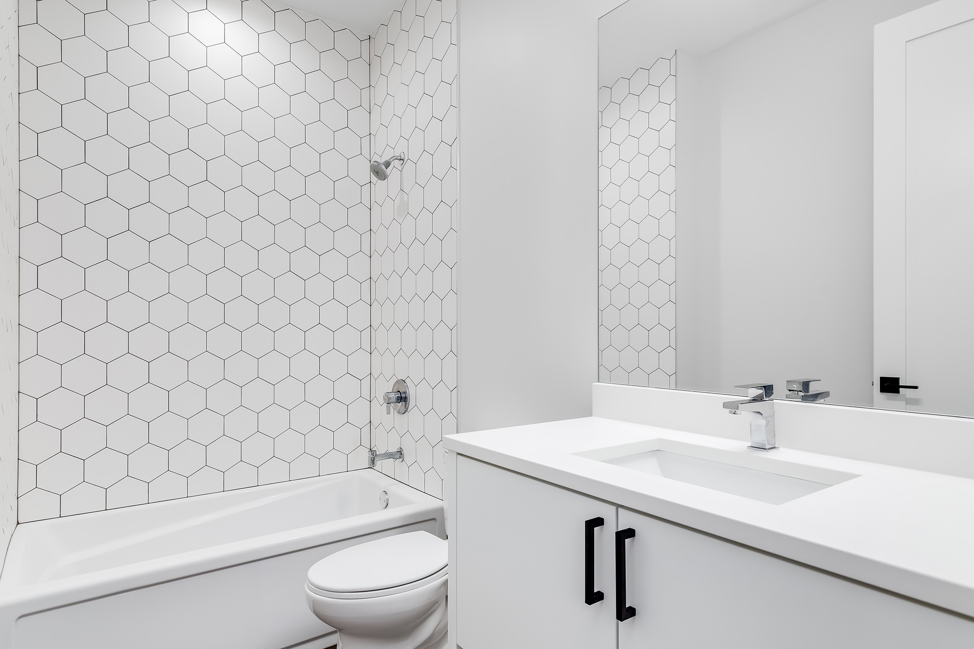
Grout has traditionally been chosen to disappear, matched as closely as possible to the tile so the lines barely register. Treating grout as its own design decision instead, choosing charcoal, terracotta, or deep green tones to frame a tile pattern, gives homeowners a way to add character to a simple tile layout without changing the tile itself.
Why Grout Is Worth Treating as a Design Decision
A high contrast grout turns a simple subway or square tile layout into a graphic pattern, since the grout lines define the geometry of the installation as much as the tile does. This gives homeowners a low cost way to make a familiar, budget friendly tile choice feel distinctive without upgrading to a more expensive tile product.
Grout color also lets a tile installation tie into the rest of a room's materials in a way a plain white grout cannot. A warm terracotta or clay colored grout reinforces a warm, earthy palette, while a charcoal or graphite grout grounds a cooler, more minimal room.
Where Bold Grout Works and Where It Does Not
Bold grout reads best against a simple tile shape, since a busy pattern combined with high contrast grout competes with itself visually. A classic subway tile, a large format square, or a herringbone layout all handle a strong grout color well because the tile geometry stays legible.
Highly veined natural stone look tile or an already patterned porcelain tends to look best with a grout that stays closer to the tile's own tone, since the goal there is letting the tile carry the visual interest. Kitchens, powder rooms, and entryways tend to be the easiest places to experiment, since they are lower cost to redo later if a homeowner's taste shifts.
What Colored Grout Means for Maintenance
Darker grout, particularly charcoal and black, actually hides everyday grime better than a light or white grout does, which makes it a practical choice for a kitchen floor or a high traffic entry. Lighter bold tones like terracotta or clay show soil differently than white grout, so sealing becomes more important to keep the color consistent over time.
Any colored grout benefits from a quality penetrating sealer applied after installation and reapplied on a normal maintenance schedule, since an unsealed grout line absorbs spills unevenly and can shift in tone faster than a sealed one. This is a conversation worth having with your installer before the project starts, not after the grout has already cured.
Choosing a Shade That Will Still Look Right in a Few Years
The safest approach is picking a grout tone that relates to an existing fixed element in the room, such as cabinetry, countertop veining, or window trim, rather than matching it purely to a photo from a single project. This keeps the finished space feeling intentional and personal rather than tied to a specific moment in design history.
Charcoal or black grout pairs well with white or light gray tile and hides daily wear
Warm terracotta or clay grout suits earthy, neutral toned tile palettes
Deep green or navy grout works best as an accent in a smaller space like a powder room
Matching grout to an existing cabinet or trim color keeps the look grounded and easy to live with long term
Testing a sample board with your actual tile and a few grout options under your home's lighting is the best way to confirm a choice before it becomes permanent.
Try It Before You Commit
Bold grout is an easy way to add character to a classic tile choice without redoing an entire room, but it is worth seeing the combination in person before it goes on your walls or floor. CarpetWorks can show you tile and grout samples side by side so you know exactly what you are getting.
Explore our tile flooring selection or visit East Hartford, CT to see grout color options against real tile samples. We proudly serve New Haven, Waterbury, Hartford, East Hartford, West Hartford, Middletown, and Manchester, CT, and our design team can help you pick a combination that will still look right for years to come. Contact us to schedule a showroom visit.


